HOW TO COMPOSITE - PHOTOSHOP TUTORIAL
Hey lovely people! Thank you for landing on this blog post, you are most likely here because you are curious as to how I edited my latest image ‘Attachment’. Well, you are in luck because I’m here to tell you the exact techniques that I used to merge all the images together in Photoshop to achieve the overall ‘realistic’ image, yey!
Here's a before and after of the original image and the final image:
STEP 1: TAKE A SET OF IMAGES IN THE SAME PLACE USING A TRIPOD.
Before we dive in to the edit, you might be interested to see the behind the scenes video showing how I shot the image. We took ourselves to Hargate Forest (which is aprox. a 4 minute drive from my house - it’s amazing having a wonderful location so close to me!). We shot the image in one of the open fields in the middle of the forest, I’m always drawn to this area! In the video, I explain my process from drawing out the idea, choosing the props, comparing locations, setting up the tripod, shooting the base image and finally, shooting the composite ‘ribbon’ images.
Here’s a link to that video so you don’t have to go anywhere (because I’m kind like that! lolol);
STEP 2: CHOOSE BASE IMAGE
Let’s begin with what I like to call the ‘Base Image’. This is an image that usually consists of the best pose for the final shot. I select the image with the most suitable facial expression or poise. I like to start with the expression, because it’s always easier to add in hair, legs, arms, dresses if needs be.
The process of choosing the base image starts with narrowing down the images by a process of elimination. I use the program ‘Bridge’, which everyone always questions, because it’s the forgotten Adobe program that CC provides. I’ve used it since starting photography and my process of choosing the images hasn't really changed since the start of my journey. It seems to be the best way for me, but you can use whatever you like! (You don't need bridge but it makes it easier.)
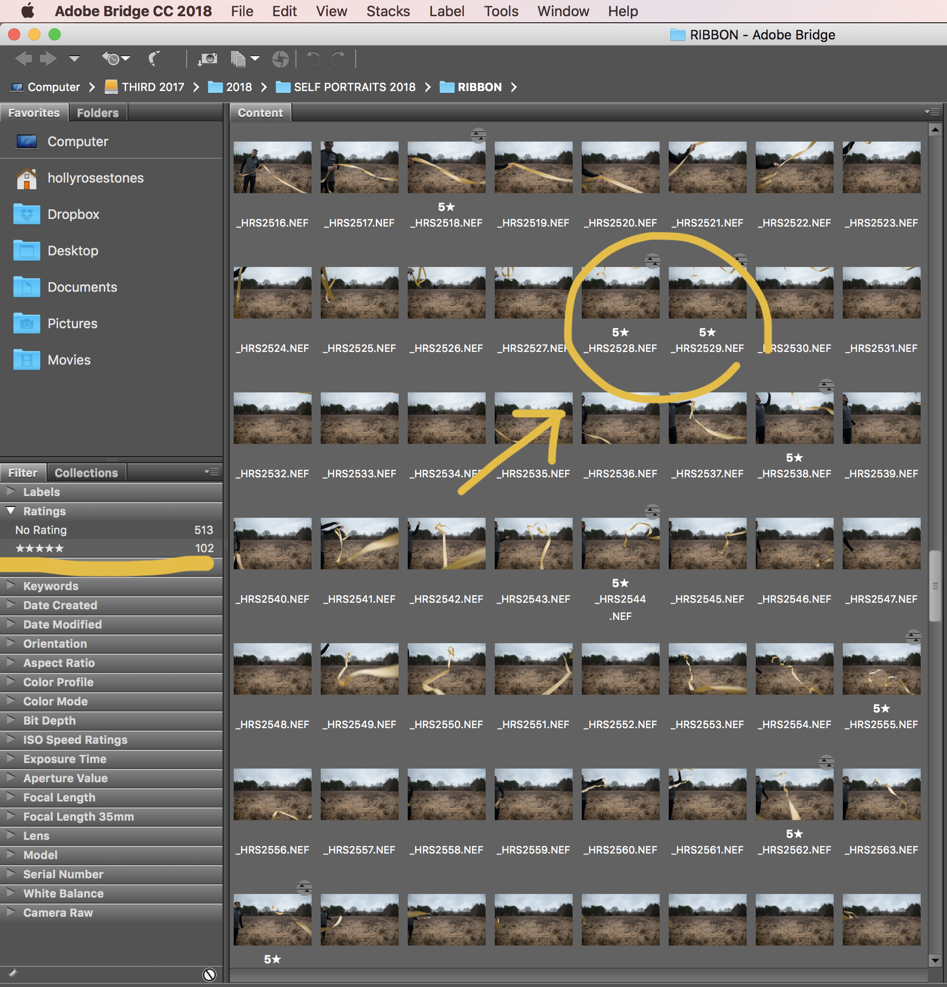
I’m quite the indecisive person so I always like to start by going through the images putting a '5 Star Rating' (shortcut - Cmd + 5 on Apple) on the images that I think will work in the final image. See below image for example:
As you can see in the above screenshot, I managed to choose 102 images, and although this includes the composite images, I will need to narrow it down further.
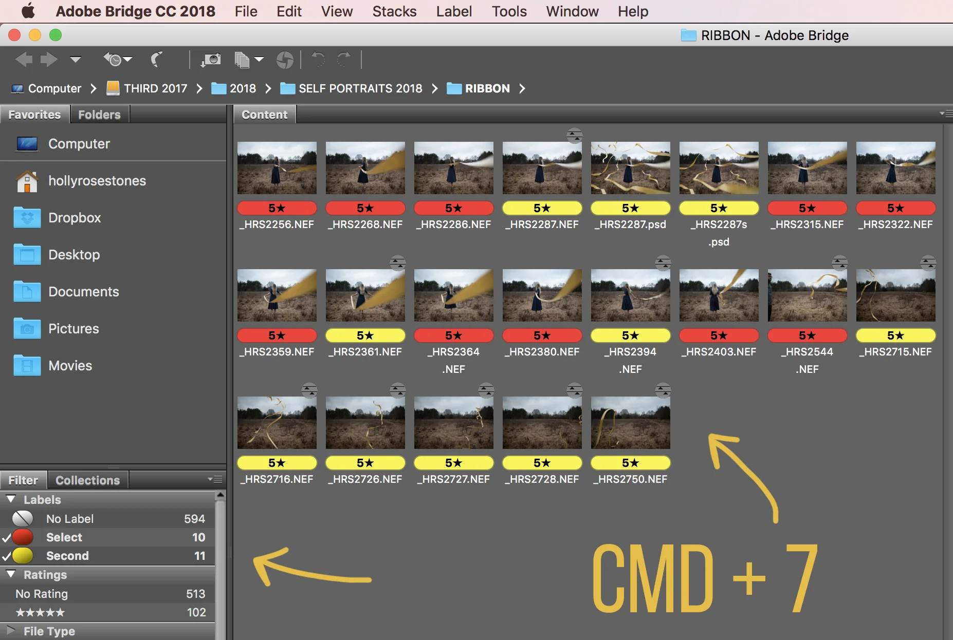
I then go through the images again and label the next round with a 'Red Label' (the correct term is 'Select' in Bridge - Cmd + 6). On this time round, I'm looking for images to use for the base image.
Once I have a selection of images that is easier to manage, I then go through a third time and label the images with a 'Yellow Label' (the correct term is 'Second' in Bridge, but aint' no body got time for that!)
Finally, I open the last selection of images (in Yellow) into Photoshop and analyse these images to pick the best one for the base image. In this case, I was stuck between these two images:
In the end I decided to go with the left image because I felt the composition had more connection with the camera/viewer and reflected my original idea the best.
3. EDIT THE BASE IMAGE & BEGIN COMPOSITING ON TOP
I usually clean things up and do a light retouch/edit on the image before I start compositing, however in this case I decided to start with pasting in the composite images first.
We took SO many images of the ribbon (as you saw from the behind the scenes video!), so I decided to open each of the selected composite images and paste them onto the image using the following technique:
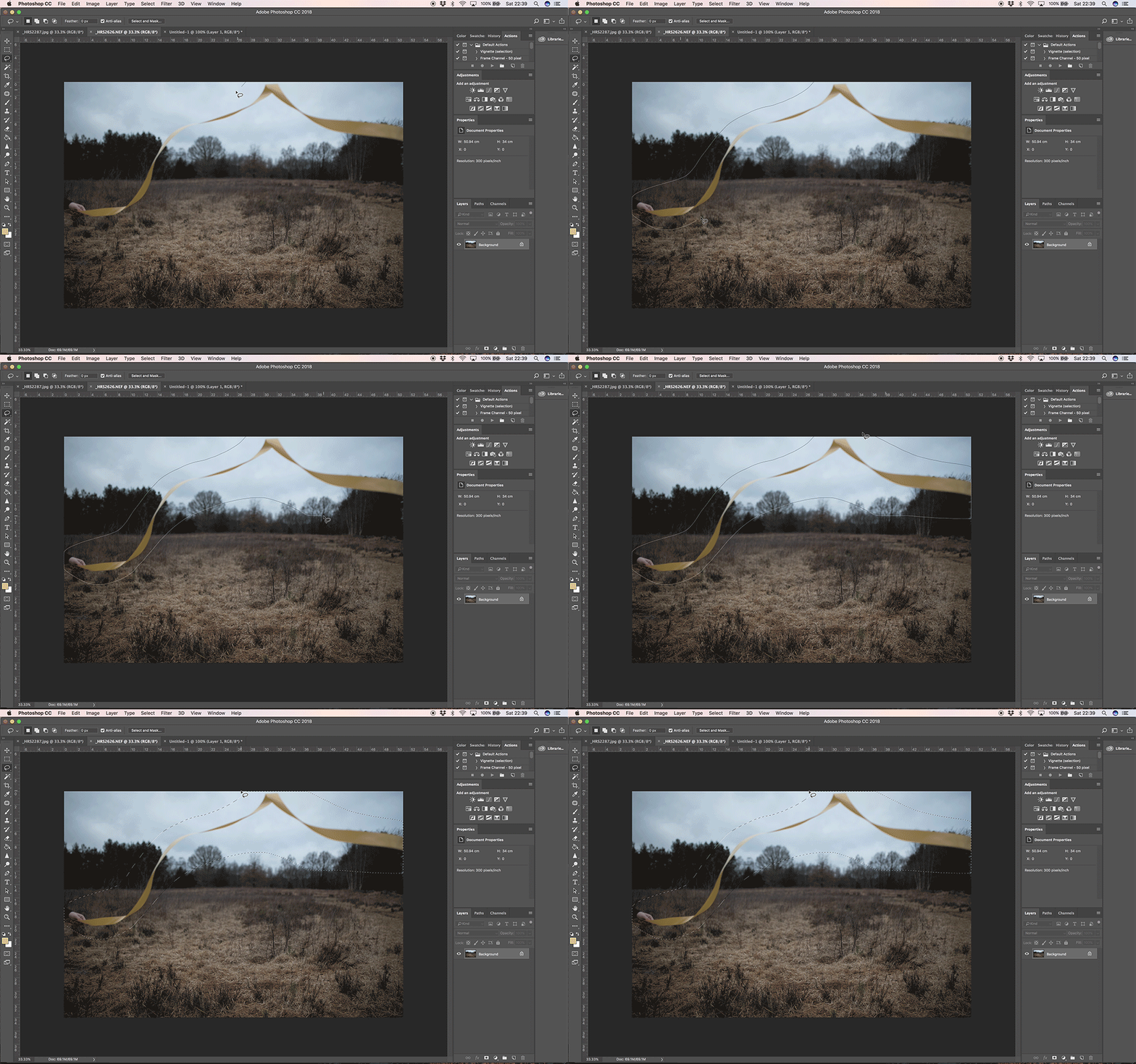
Using the 'Lasso' tool with the 'Feather' set at 0 px, I drew a selection around the ribbon with about a 1-2cm gap around the edge of the selection, to allow for layer masking later.
Once I made the selection, I copied and pasted the selected image onto the 'base' image. To do this I did the following:
EDIT > COPY on the selected image.
EDIT > PASTE SPECIAL > PASTE IN PLACE
4. COLOUR/LIGHT ADJUSTMENTS
The ribbon selection has now been pasted into place onto the 'base' image, and the next step is to match the images using the adjustment tools.
As you can see, although this image was taken on the same day, the light changed as we were shooting. So before I start the layer masking, I need to make sure the images match in tones and colours. To do this I select the layer that contains the ribbon selection;
I then go to IMAGE > ADJUSTMENTS and start with > Brightness/Contrast.
I upped the brightness and contrast to match the background.
5. LAYER MASKING
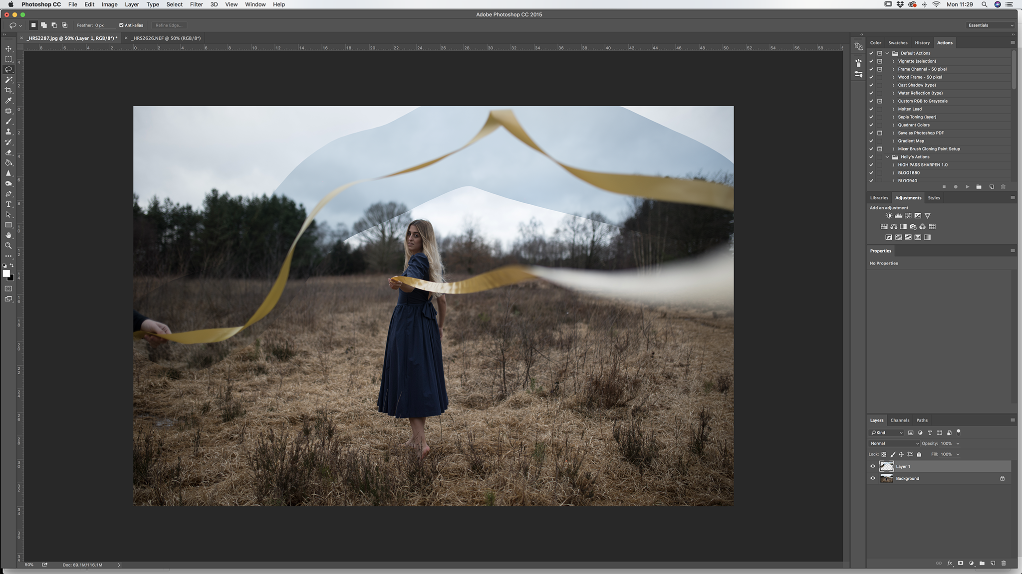
After I matched the brightness of the selection, I then began to erase out some of the background of the selection using LAYER MASKS.
To add a simple layer mask, select your layer and click on the button at the bottom of the layer panel that has a black circle in the middle. See below;
The next thing I did was select the brush tool, making sure to change the brush colour to black.
Using the brush tool I went around the ribbon selection and erased away any unwanted areas. This blends in the layered image and makes it more realistic.
I then repeated this process to all the other layered ribbons.
6. CROPPING
After I had added in the final ribbons, I decided that the image looked much better as a square image. I spoke about this in my behind the scenes video. I felt it didn't balance as well being a landscape image. So I cropped it square and evened out the ribbon so that it flowed better in the image.
7. COLOUR GRADING/USING PRESETS
Finally I opened up the image into Lightroom and added my presets. I usually start with LXC and build upon the colours in Photoshop after the preset has been applied.
Here's a little process of change that the image went through as I edited the colours.
Annnnd that's it!
Hope you enjoyed this littler tutorial, I've uploaded a speed edit over on my YouTube too so you can go check out the quick version of this tutorial. Let me know what you thought to this and if you think I should do more of these. Leave a comment below!!
SPEED EDIT
Thanks for reading guys!
Holly x


